Cocos Creator Component -- Tooltip Manager
A downloadable Cocos Component for Windows
📌 Introduction
This component provides a flexible tooltip system for Cocos Creator. Features include:
- Multiple show modes: normal, fade opacity, and scale popup.
- Customizable themes with color and background sprites.
- Smooth mouse-following tooltip behavior.
- Works on UI nodes and world space objects.
- Easy integration with your projects.
The system consists of two scripts:
- Tooltip.ts – The main tooltip manager.
- TooltipTarget.ts – Attach to any node to display a tooltip on hover.
----------------------------------------------------------------------------------------------------------
🎮 Supported Effects
- Show Modes (configurable per Tooltip node):
| Mode | Description |
|---|---|
| NORMAL | Instantly shows tooltip without animation. |
| FADE_OPACITY | Fades in/out the tooltip with adjustable opacity. |
| SCALE_POPUP | Scales the tooltip from small → normal size. |
- Themes (affects text and background):
| Theme | Color Example | Background Sprite |
|---|---|---|
| NORMAL | White (255, 255, 255)
| normalBg
|
| RARE | Blue (80, 160, 255)
| rareBg
|
| EPIC | Purple (180, 80, 255)
| epicBg
|
| LEGENDARY | Orange (255, 180, 0)
| legendaryBg
|
- Mouse Follow:
- Tooltip can follow the cursor when hovering over target nodes.
- Optional smooth interpolation for natural motion.
- Auto-flip to prevent tooltip from going off-screen.
----------------------------------------------------------------------------------------------------------
✅ Installation
- Copy the
Tooltip.tsandTooltipTarget.tsscripts into your Cocos Creator project'sassets/scriptsfolder. - Create a Tooltip Node in your scene:
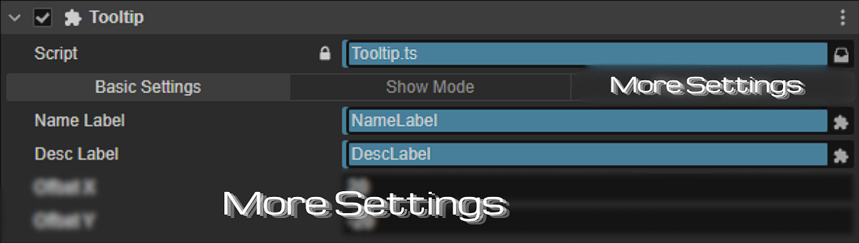
- Add
Tooltipcomponent. - Assign
nameLabelanddescLabel(Label nodes for title & description). - more settings
- Add
- Attach
TooltipTargetto any node you want to display a tooltip for.
----------------------------------------------------------------------------------------------------------
🛠️ How to Use?
Tooltip Node Setup
- Drag a Label for nameLabel.
- Drag a Label for descLabel.
- Drag a Sprite for bgSprite (background image).
- Set
ShowMode:- Normal – instantly show/hide.
- Fade Opacity – set start/end opacity, fadeIn/out duration, linger.
- Scale Popup – set start/end scale, duration.
- Configure theme colors and sprites as desired.
TooltipTarget Node Setup
- Attach
TooltipTargetto any node (UI or 2D world node). - Configure:
-
itemName– tooltip title. -
description– tooltip content. - more settings
-
- Optional:
-
autoFlip– automatically flips tooltip to stay inside screen bounds. - Smooth follow speed can be adjusted via
smoothSpeed.
-
----------------------------------------------------------------------------------------------------------
🖱 Follow Mouse
- Tooltips can optionally follow the mouse cursor.
- Smooth follow uses linear interpolation to create natural motion.
- Example configuration:
enableFollowMouse = true;
enableSmoothFollow = true;
smoothSpeed = 10;
offsetX = 10;
offsetY = 0;
autoFlip = true;
----------------------------------------------------------------------------------------------------------
🎞️ Test Scene
- Create a Canvas in your scene.
- Add a Tooltip Node (with Tooltip component).
- Create several UI buttons or sprites.
- Attach TooltipTarget to each node.
- Configure
itemName,description,theme, and follow options. - Run the scene. Hover over nodes to see the tooltip appear with selected animation and theme.
⚠ Notes
- Only one
Tooltipinstance is supported per scene. - Make sure
nameLabelanddescLabelare assigned in the inspector. - Tooltip respects screen bounds to prevent overflow.
-
TooltipTargetautomatically hides the tooltip when mouse leaves. - Compatible with Cocos Creator 3.x.
----------------------------------------------------------------------------------------------------------
❓ FAQ
Q: Can I have multiple tooltips at once?
A: No. This system uses a singleton pattern; only one tooltip shows at a time.
Q: Can I change the tooltip dynamically at runtime?
A: Yes. Call Tooltip.show(name, description, worldPos, theme) to update content and position.
Q: Can I use it on world space objects?
A: Yes. It works for both UI nodes and world space objects.
Q: How do I add a new theme?
A: Add a new TooltipTheme enum value, then assign colors and background sprite in Tooltip.
Q: What happens if I disable follow mouse?
A: The tooltip will appear at the target node's world position instead.
📩 Contact:
Discord: KEN LOO
(Add me as a friend to message)
----------------------------------------------------------------------------------------------------------
📄 License
- Allowed for use by individuals and commercial projects
- Resale or redistribution of the source code is not permitted.
----------------------------------------------------------------------------------------------------------
❤️ Support
If you encounter any problems while using it, feel free to leave a comment below. Thank you for using Tooltip Manager! More updates are coming soon!
Purchase
In order to download this Cocos Component you must purchase it at or above the minimum price of $0.50 USD. You will get access to the following files:

Leave a comment
Log in with itch.io to leave a comment.